Oh my Brusho!

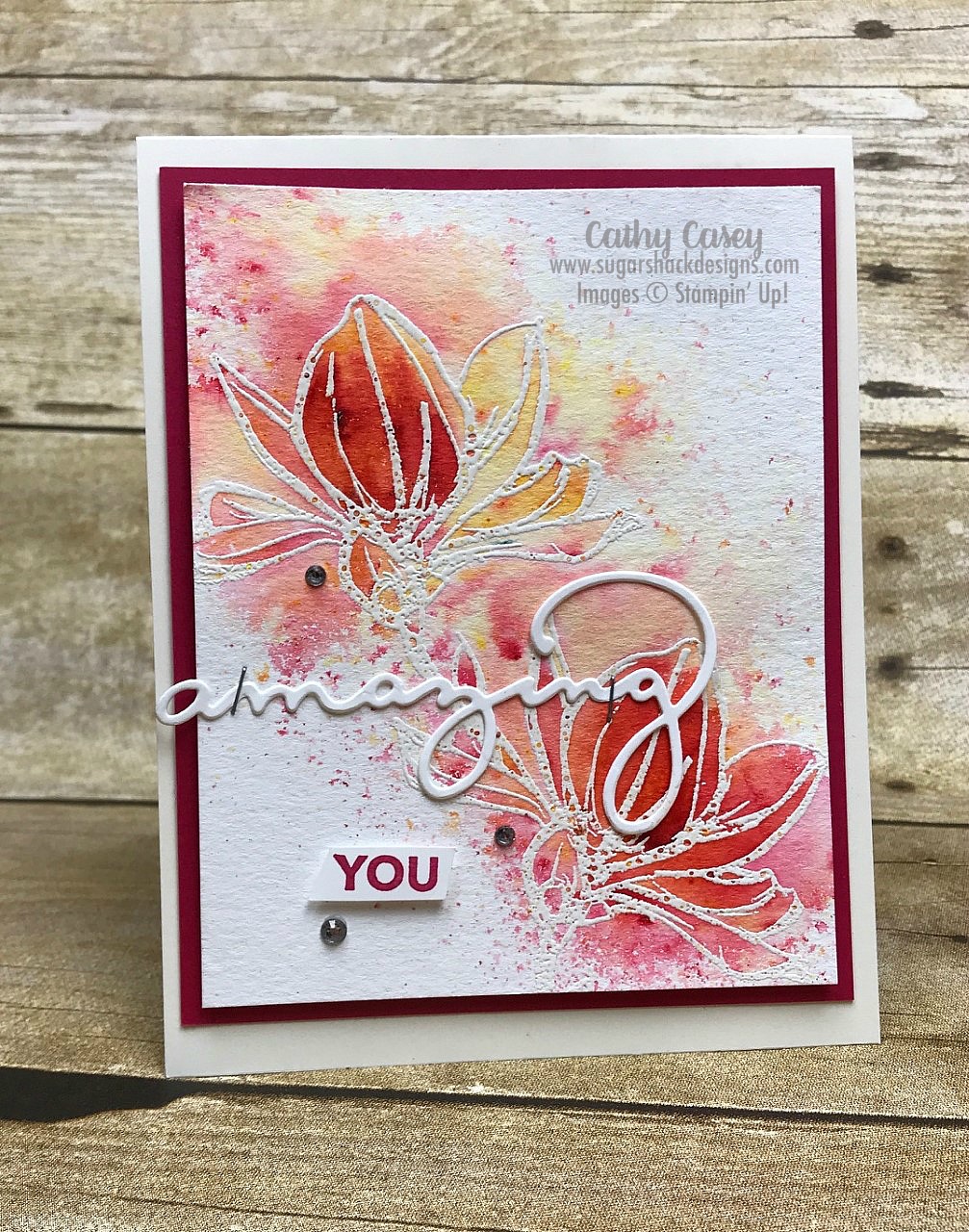
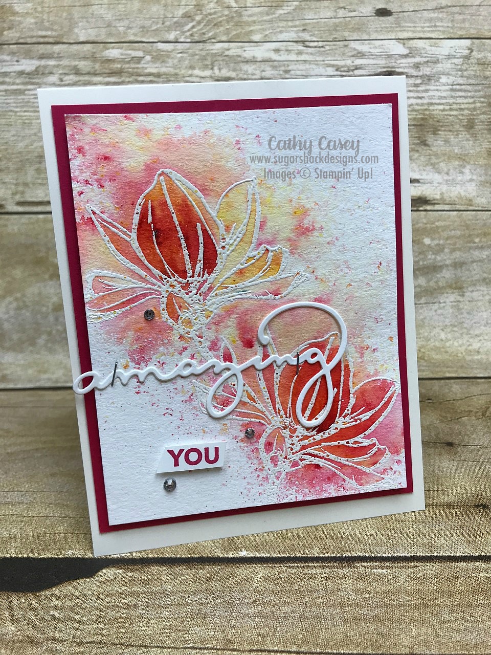
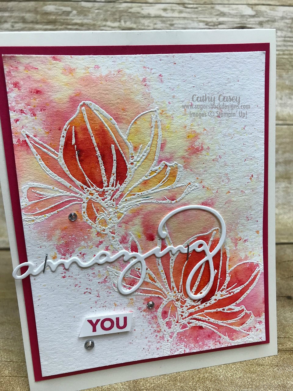
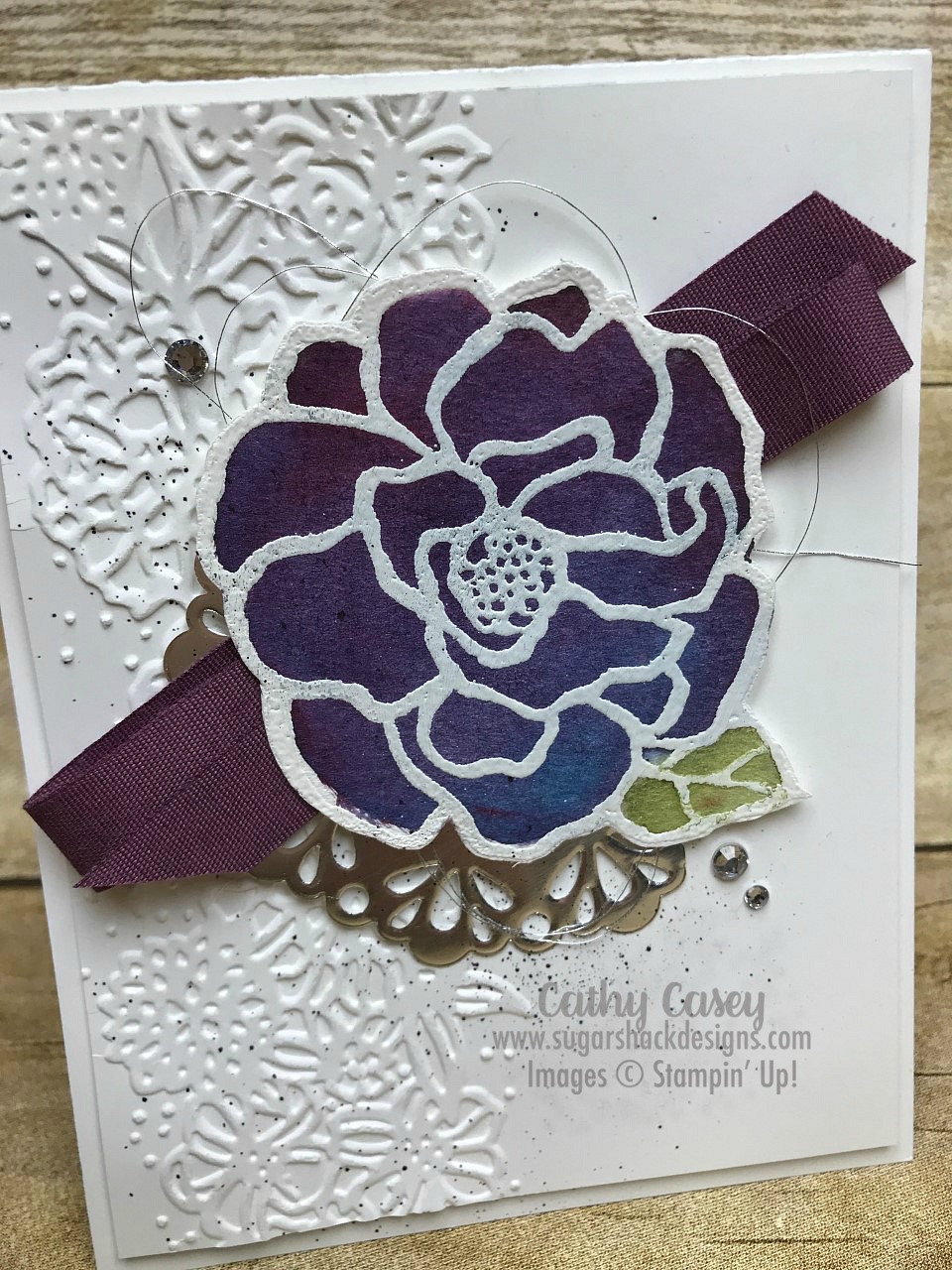
I did a fun Brusho technique class a few weeks ago and this is one of the projects we made.  It is stunning visually and it was super easy to make!

Beautiful Day Stampin' Up

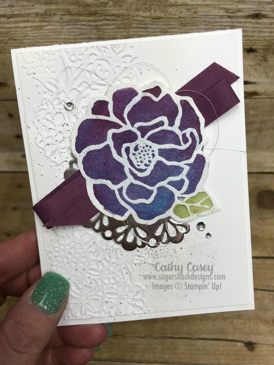
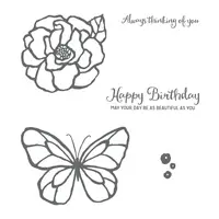
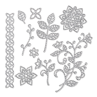
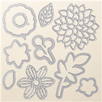
The Beautiful Day Stamp Set is perfect for this technique.  We white embossed the big flower image on watercolor paper and then used Brusho to add the color.  This flower features Prussian Blue and Brilliant Red, they create this luscious blueish purple color when they are allowed to activate together with water and not over worked.  So pretty!  After the flower dried, we fussy cut it out and popped it onto the card front.  The rest of the card was fast and easy and showcased the beautifully colored flower 🙂

Beautiful Day Stampin' Up

So gorgeous!

Creative Tips:

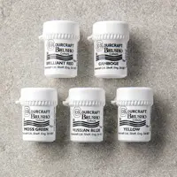
  1.  After you have embossed the flower, paint with water first everywhere inside the flower.  Sprinkle on your Brusho, more red towards the top and more blue towards the bottom.  You can always add more of the Brusho crystals if the you don’t like the initial color saturation, it is much harder to pull the color back without it getting muddy.  If your flower is too wet, blot with a paper towel.  Let your flower dry completely before fussy cutting.
  2. The leaf is colored with Moss Green Brusho.  I have also seen posts where demos have added ink color to the green as an underlying tint.  That’s really pretty too.  With this one I just painted the leaf with water first and sprinkled a little Moss Green and then didn’t work it too much with the aqua painter after adding the Brusho.
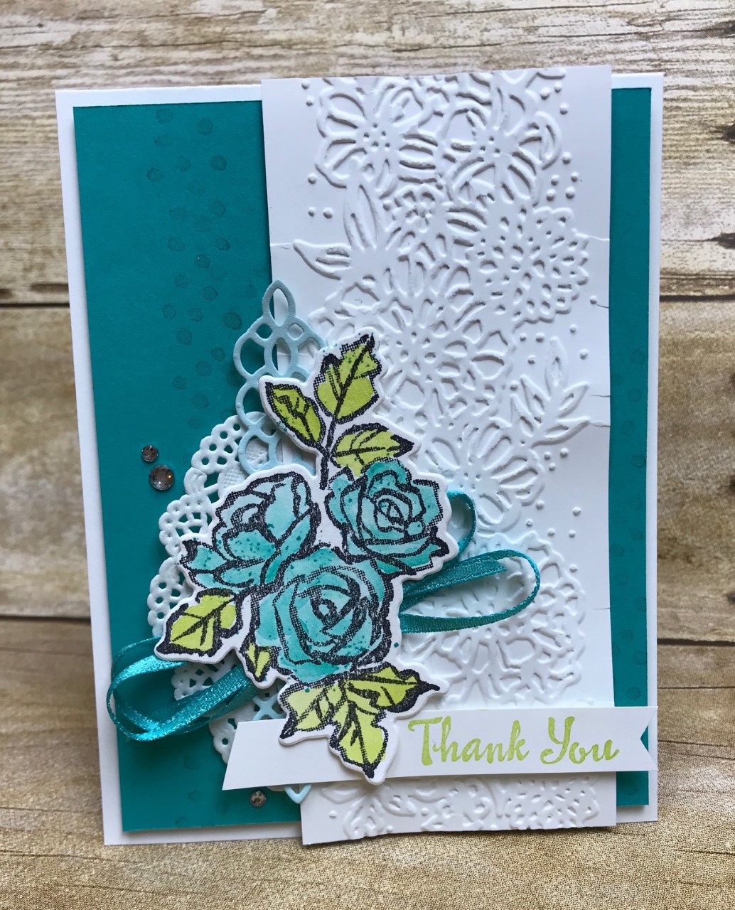
  3. The added ribbon and bling give the card some pop with the deeply saturated flower.  I love the simple richness.

I hope you have a fabulous, creative day!  Happy Stamping 🙂

Lilypad Lake beauty

Monday Montage Blog Hop – Week 117!!!!

Hello friends! Welcome back to the Monday Montage Blog Hop!  You won’t want to miss the amazing prettiness that I know you will find at all the stops along the way!

It’s new catalog time!!!  I’m so excited about all the new stuff, I wasn’t even sure what to start with today. I haven’t pulled out Lilypad Lake yet and I have been in love with it since the first time I laid eyes on it.  It seemed like the perfect new catalog launch project for me 🙂

Lilypad Lake Stampin' Up

Lilypad Lake Stampin' Up

Creative Tips:

  1. I just can’t even say enough how happy and excited I am that Coastal Cabana is back in the line up as a permanent member of our basic color family.  I think Coastal is my absolute favorite color of all time!!  For this card, I watercolored the water area with Coastal and a new color called Highland Heather.  I love the dreamy look these two colors give to the water.
  2. The new ink pads don’t really work very well to smush ink into the lid of the pad to watercolor with.  They are stiffer than the old style pads so I couldn’t get any ink onto the lid.  To use the pad color to watercolor, I smashed the pad against my silicon mat and then picked up the ink with my aqua painter.  This worked like a dream!

Make sure you go “back” if you missed Bree’s wonderful creation or you can loop on around by hitting the “next” button to get to Dani’s gorgeous work and the rest of the hop!  Links to all of our fabulous hoppers are listed below 🙂

  1. Amy O’Neill
  2. Breelin Renwick
  3. Cathy Casey – you are here!
  4. Dani Dziama
  5. Elizabeth Price
  6. Julie Warnick
  7. Kaitlyn Zumbach
  8. Melissa Stout
  9. Wendy Weixler

Fabulous Brusho!

Monday Montage Blog Hop – Week 116!!!!

Hello friends! Welcome back to the Monday Montage Blog Hop!  You won’t want to miss the amazing prettiness that I know you will find at all the stops along the way!

If you haven’t played with Brusho yet you are totes missing out!  It is so vibrant and you can create stunning masterpieces so quickly and easily!  The rich depth of the colors you can build with these color crystals is amazing.  The gorgeous stamp set I used is Remarkable You, it is retiring soon so get it quick if you love it as much as I do!

I had a class today featuring several techniques with Brusho and this is one of the projects we created:

Remarkable You Stampin' Up

Remarkable You Stampin' Up

Remarkable You Stampin' Up

Creative Tips:

  1. There are several ways to use Brusho, this card features sprinkling the color crystals on a dry card and then spritzing with water.  The flowers are white embossed on the watercolor paper first and they capture the watery color.  You can still see crystals that aren’t activated, it’s so pretty with the mix of fully activated colors and splatters of partially activated crystals.
  2. Don’t overwork this technique!  It is a beautiful mess with just a few spritzes of water 🙂  The colors used on this card are Brilliant Red and Gamboge (orange).
  3. You can set the colors with heat embossing before you assemble the card.

Make sure you go “back” if you missed Bree’s wonderful creation or you can loop on around by hitting the “next” button to get to Dani’s gorgeous work and the rest of the hop!  Links to all of our fabulous hoppers are listed below 🙂

  1. Amy O’Neill
  2. Breelin Renwick
  3. Cathy Casey – you are here!
  4. Dani Dziama
  5. Elizabeth Price
  6. Julie Warnick
  7. Kaitlyn Zumbach
  8. Melissa Stout
  9. Wendy Weixler

I’m just wild about this cute dino!!

I made this adorbs card for a swap quite some time ago!  This is another favorite set of mine that is retiring when the new catalog launches.  This stamp set and this designer paper is one of my favorites 🙂

Pieces and Patterns Stampin' Up

Creative Tips:

  1.  This card was so simple and fast to create!  Quick watercoloring and fussy cutting of the cute little dino was easy.  I actually love fussy cutting, it relaxes my mind (I know, sounds weird…but you should try it!)
  2. I colored in the wild about you sentiment with a marker, I used Crushed Curry to coordinate with the DSP strip on the side.
  3. Splatters of Flirty Flamingo and Emerald Envy picked up the other colors in the DSP.


Hello love!

Monday Montage Blog Hop – Week 115!!!!

Hello friends! Welcome back to the Monday Montage Blog Hop!  You won’t want to miss the amazing prettiness that I know you will find at all the stops along the way!

This time of year is always bittersweet as the new catalog is about to launch and old favorites are leaving to make room for beautiful new goodness.  One of my favorites from the current catalog is “You Deserve This”; I’ve always loved the sentiments in this set and the tiny little background images.  Here are a couple of cute, springy cards featuring this set.

You Deserve This Stampin' Up

You Deserve This Stampin' Up

Creative Tips:

  1. This has been the year of Lemon Lime Twist, Bermuda Bay and Berry Burst for me!  These colors are simply amazing together.
  2. You can use punch shapes lots of ways; on one of these cards I simply punched out Bermuda Bay card stock with the Pretty Label punch and then cut the punch shape in half to layer behind the sentiment vertically instead of horizontally.

Make sure you go “back” if you missed Bree’s wonderful creation or you can loop on around by hitting the “next” button to get to Dani’s gorgeous work and the rest of the hop!  Links to all of our fabulous hoppers are listed below 🙂

  1. Amy O’Neill
  2. Breelin Renwick
  3. Cathy Casey – you are here!
  4. Dani Dziama
  5. Elizabeth Price
  6. Julie Warnick
  7. Kaitlyn Zumbach
  8. Melissa Stout
  9. Wendy Weixler

Let’s have cake!

Monday Montage Blog Hop – Week 114!!!!

Hello friends! Welcome back to the Monday Montage Blog Hop!  You won’t want to miss the amazing prettiness that I know you will find at all the stops along the way!

I just got home yesterday from time in Florida with my bestie and a trip to Atlanta to attend Stampin’ Up’s Onstage event.  As always, I came home inspired and full of fun stamping ideas 🙂  The new annual catalog was revealed to demonstrators at Onstage and one of the super exciting things coming up in the new cattie is a core color revamp.  This means that some colors are being retired and some brand new amazing colors are coming!  I am super excited about the new colors and can’t wait to get my hands on them, I am also a little sad about a couple of the colors that are retiring.  Of course, there are new In Colors which means the ones introduced in 2106 are leaving us, I loved these colors and used them a lot!  I will be featuring my faves over the next few months for sure!  One of the colors that is retiring this year from the basic colors is Marina Mist, I have always loved this color although I have not used it as much lately as I should have lol.  Today’s card features the beautiful color Marina Mist and the Cake Soiree stamp set.  Cake Soiree is sticking around in the new catalog and that makes me happy pants 🙂

Cake Soiree Stampin' Up

Cake Soiree Stampin' Up

Creative Tips:

  1. Two of the colors in the DSP featured in this Suite are Marina Mist and Berry Burst and they are magical together!  The Berry Burst pops off of this card in the flower die cut and the ribbon….swoony!
  2. Simple stamping on this card make it lovely and rich.  I silver embossed the cake image with the flower designs on Marina Mist, I love how subtle and pretty this is.
  3. Paper embossing with the Scattered Sequins embossing folder gives interest to the white on white look of the card base and the card top.

Make sure you go “back” if you missed Bree’s wonderful creation or you can loop on around by hitting the “next” button to get to Dani’s gorgeous work and the rest of the hop!  Links to all of our fabulous hoppers are listed below 🙂

  1. Amy O’Neill
  2. Breelin Renwick
  3. Cathy Casey – you are here!
  4. Dani Dziama
  5. Elizabeth Price
  6. Julie Warnick
  7. Kaitlyn Zumbach
  8. Melissa Stout
  9. Wendy Weixler

Happy Easter

Monday Montage Blog Hop – Week 113!!!!

Hello friends! Welcome back to the Monday Montage Blog Hop!  You won’t want to miss the amazing prettiness that I know you will find at all the stops along the way!

I wanted something soft and sweet for Easter Sunday so I turned once again to the Petal Palette Suite.  I just love how this project came out 🙂

Petal Palette Stampin' Up

Petal Palette Stampin' Up

Creative Tips:

  1. The background flowers were stamped off in Daffodil Delight and then a piece of vellum was placed on top of the base.  This created a soft background for the card, it is so pretty!
  2. After stamping the bird image in Daffodil Delight on watercolor paper, I used my aqua painter with water only to soften the image.  This little birdie almost looks like an Easter chick 🙂
  3. Adding the bit of Old Olive ribbon underneath the bird draws the eye in and adds a pop of a different color from the main scheme.

Make sure you go “back” if you missed Bree’s wonderful creation or you can loop on around by hitting the “next” button to get to Dani’s gorgeous work and the rest of the hop!  Links to all of our fabulous hoppers are listed below 🙂

  1. Amy O’Neill
  2. Breelin Renwick
  3. Dani Dziama
  4. Elizabeth Price
  5. Julie Warnick
  6. Kaitlyn Zumbach
  7. Melissa Stout
  8. Wendy Weixler

Petal Palette Pretty

Monday Montage Blog Hop – Week 112!!!!

Hello friends! Welcome back to the Monday Montage Blog Hop! You may have gotten here from the amazing Bree Renwick’s blog, make sure you select the “next” button below and that will take you to the next stop on the hop, Dani’s beautiful work.

I love this Petal Palette Suite….sooooo versatile and easy to use!  This cute thank you card was easy to put together and is a perfect thank you for someone special 🙂

Petal Palette Stampin' Up

Petal Palette Stampin' Up

Creative Tips:

  1. Stamping the background image in Bermuda Bay on the Bermuda Bay card front gives a subtle background that adds interest to the card.
  2. The flower stamp is stamped in Archival Black on Watercolor paper and then watercolored with Bermuda Bay and Lemon Lime Twist.
  3. It was fast and easy to layer the main focal point of the card with the stamped flowers, doilies and ribbon.

Make sure you go “back” if you missed Bree’s wonderful creation or you can loop on around by hitting the “next” button to get to Dani’s gorgeous work and the rest of the hop!

More Sale-a-Bration Beauty!

Monday Montage Blog Hop – Week 111!!!!

Hello friends! Welcome back to the Monday Montage Blog Hop! You may have gotten here from the amazing Bree Renwick’s blog, make sure you select the “next” button below and that will take you to the next stop on the hop, Dani’s beautiful work.

I just can’t believe this stamp set and framelits set are FREE!!  Gosh, I love them so much!  Today’s card features a mix of the stamps and the framelits and I couldn’t love it more!  Only one more month of Sale-A-Bration, don’t miss these beauties:  the stamp set is free with a $50 order and the framelits are free with a $100 order 🙂

Amazing You Stampin' Up

Amazing You Stampin' Up

Creative Tips:

  1. The watercolor swoosh of Fresh Fig sets off the framelit words perfectly.  After the watercolor background dried, I added a splatter of Bermuda Bay on top.
  2. I gave the die cut “amazing” some heft by cutting it once in Bermuda Bay and two more times in Whisper White.  I love how you can see the white behind the Bermuda Bay,
  3. The entire card front is offset on the front of the card and the flower die from the May Flowers Framelits picks up the Lemon Lime Twist in the stamping and the “YOU” die cut.  The offset and the die cut add interest and make the whole card front pop.

Make sure you go “back” if you missed Bree’s wonderful creation or you can loop on around by hitting the “next” button to get to Dani’s gorgeous work and the rest of the hop!

Mountain Magic!

Monday Montage Blog Hop – Week 110!!!!

Hello friends! Welcome back to the Monday Montage Blog Hop! You may have gotten here from the amazing Bree Renwick’s blog, make sure you select the “next” button below and that will take you to the next stop on the hop, Elizabeth’s beautiful work.

If you have not played with the Waterfront stamp set yet, you absolutely must order it now!  It is so easy to create amazing art work with!  You just need the set, watercolor paper, some ink and water.  The results are simply stunning!

Waterfront Stampin' Up


Waterfront Stampin' Up

Creative Tips:

  1. I used several colors to stamp my mountains and I used various amounts of ink (stamping off several times with some images).  After layering the images many times, I went back in with an Aquapainter and melted my images together.  Colors used:  Early Espresso, Night of Navy and Tranquil Tide.  I did the same thing with the water using Bermuda Bay, Dapper Denim and Pool Party.
  2. The lone bird is from Wherever You Go stamp set.  If your image isn’t dark enough on the Watercolor Paper, fill in with a Basic Black marker.
  3. I love how the sentiment floats over the card with the landscape coming through the vellum

Make sure you go “back” if you missed Bree’s wonderful creation or you can loop on around by hitting the “next” button to get to Elizabeth’s gorgeous work and the rest of the hop!